If you’re pregnant or planning on having a baby, you are most likely thinking about the space you have in your house, what room will be dedicated to the child and simply how you will want to decorate the nursery or toddler room. Some people have a lot of space to work with, and others living in small spaces have to be creative.
For us, although we had a 3 bedroom house, each one was being used up. One was our room, the other our in home office and downstairs was the guest bedroom. Ideally, we didn’t want to keep going up and down the stairs to check on our child, so for my first (Ryden) we converted our office into an office/baby room. One side we just put his crib, and got some shelving from the Container store . My husband put it up with some drawers underneath and created a small area to hang and organize his clothes and necessities. I didn’t really get to decorate a nursery or go through what many people call the “nesting phase”.
When we got pregnant with our second, Kayden, we knew we needed more space. We had always discussed converting our back outdoor patio into a room. We never used it and it was big enough to actually be a room all in itself, so we ended up doing that. Our 3 bedroom, soon became a 4 bedroom! Now the fun began. I was able to put my interior decorating skills to work and started scouring the internet for inspiration and ideas. The difficultly with this room was that it isn’t that big and didn’t come with any closet or shelving space. This had to all be created. The room was also unique shaped and had a small protruding wall coming into the space that I needed to think about what do with.
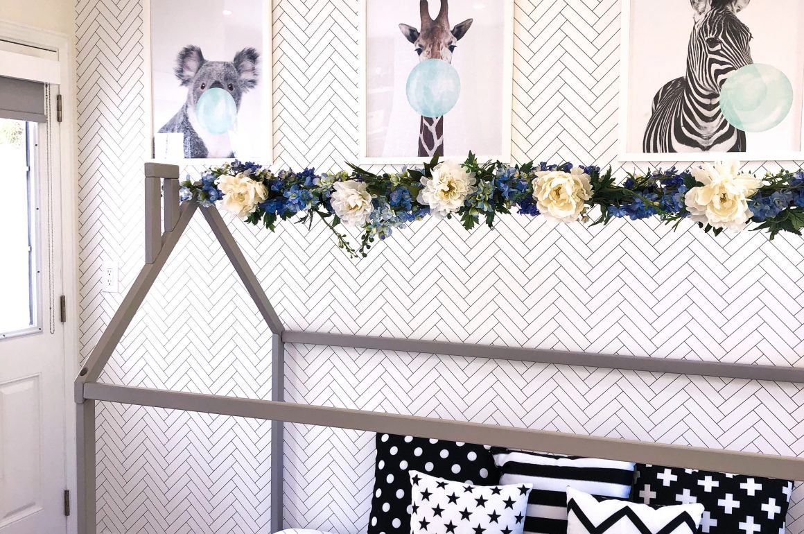
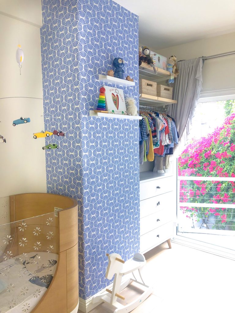
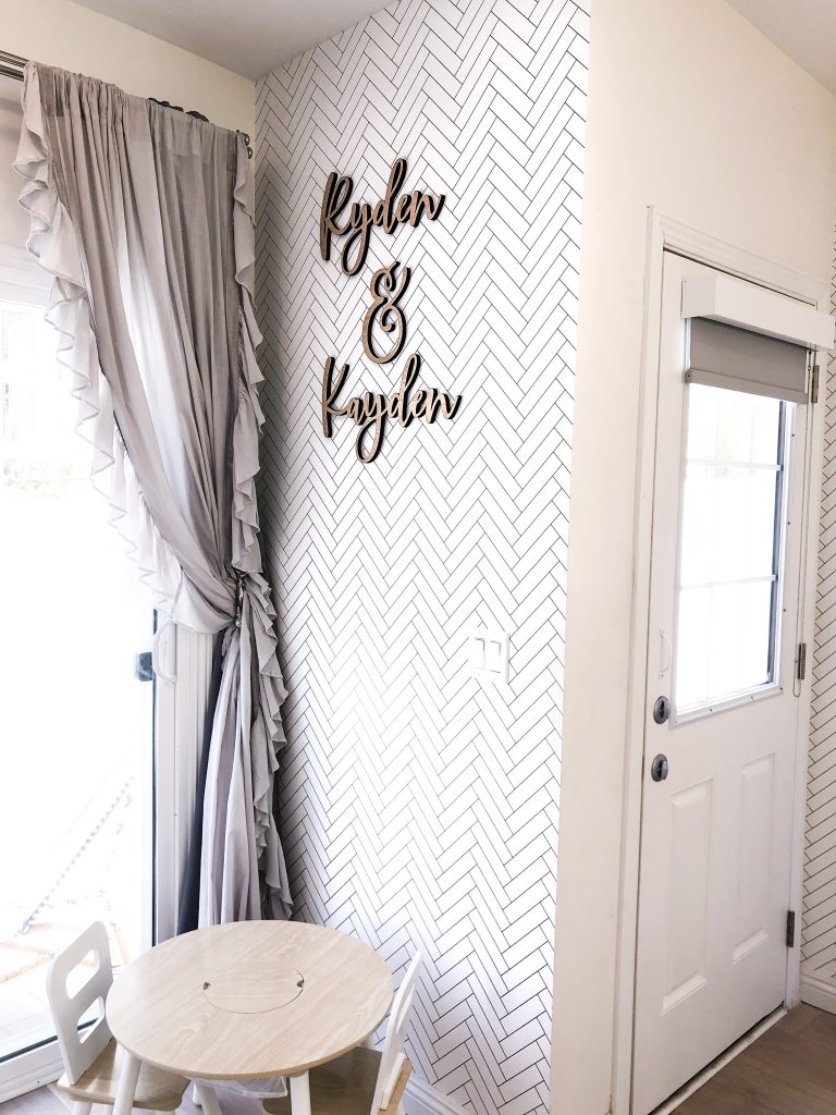
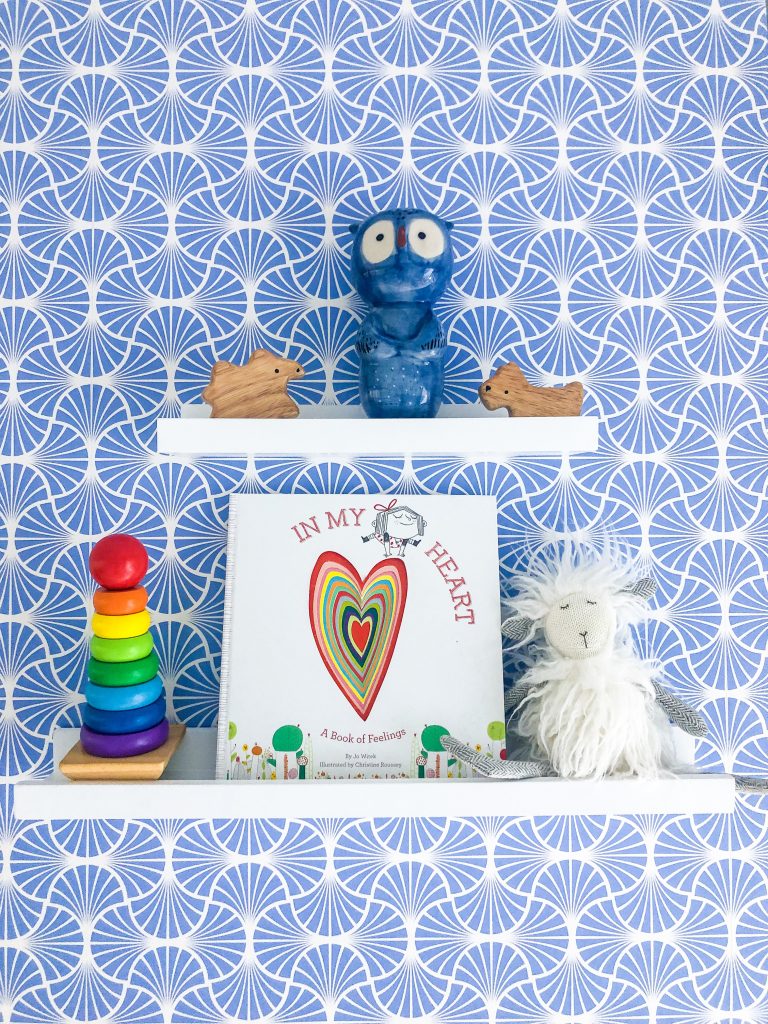
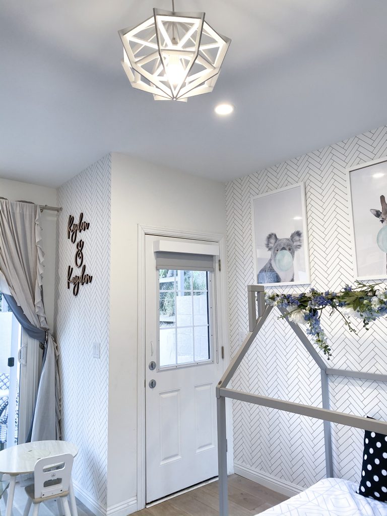
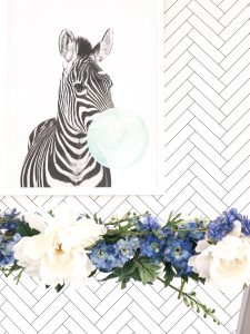
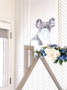
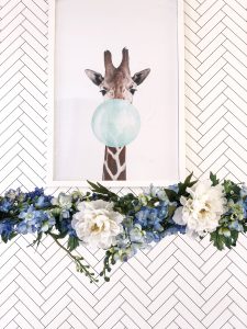
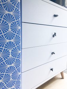
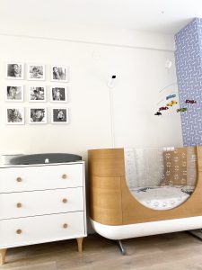
Firstly, let me say that I am a lover of wallpaper. Wallpaper has definitely made a comeback, however some may still think of it as something old people use. Well, not if you go with an amazingly beautiful wallpaper company like Milton & King. Just take a look at the website. The most BEAUTIFUL wallpaper ever and plenty of wallpaper for the kids room and nursery. I had such a hard time choosing! I knew from the get go that I wanted an accent wall. I knew I wanted to hang some framed images on this wall. so didn’t want it to be too busy and wanted to keep the room very light and bright. I went with their herringbone wallpaper, called Tile Progress, which is subtle, classy and yet adds that extra something to the room. I then hung up these adorable animals blowing bubble gum on the wall in white frames, because it is of course a kid’s room! =) For the small protruding wall, I used a more vibrant beautiful raceway blue wallpaper with their Empire Weave design. Now this wall was no longer an eye sore but a nice feature in the room. I set a couple shelves on it to be able to place a few items for decor.
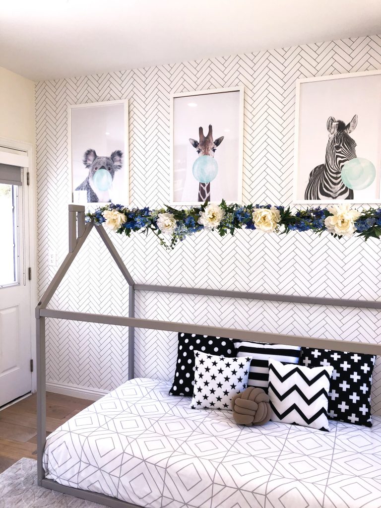
We already had a beautiful crib we had bought for Ryden by Ubabub. Some of the most stylish cribs out there in my opinion. Our crib also converts into a toddler bed eventually when we need it, so super helpful and don’t need to spend the extra money for an additional bed when we get to that stage. We also needed a second bed for when we transition my 2 year old, Ryden, from the crib into the toddler bed. I wanted something fun, unique and different. I found this company on Etsy called Sweet Home from Wood. They made these absolutely adorable Montessori house beds that I fell in love with. You can get them in any color. I chose a subtle grey. I knew that I wanted to soften up the room a little and am obsessed with everything flowers, however do not like the maintenance they come with. So, I decided to go grab some fake flowers from a large craft store downtown in a mixture of the white and blue that were in my wallpaper design, with some green leaves and DIY the flower garland you see at the top of the bed using green craft tape.
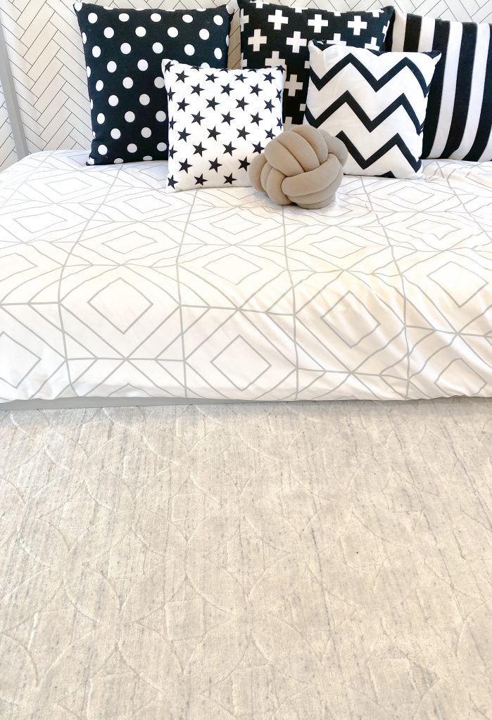
I have always liked mixing different patterns together that seem like they should not go together. I found our stunning decorative pillows from Delinda Graphic Studio and the bed sheets and cover from Daysend Designs, with the little brown accent in the knot pillow by Silver Sea Crafts. All Etsy!! I absolutely ADORE Etsy!
I thought it would be cute to have their names cut out in wood as an accent piece on one of the walls. Adoren Studio did such a gorgeous job! The names are light and easily attachable with those thick white double sided tape. I just put it up myself!
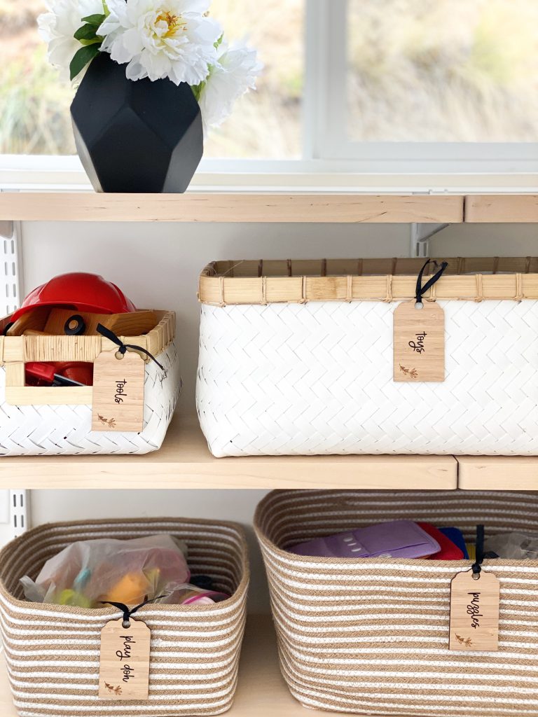
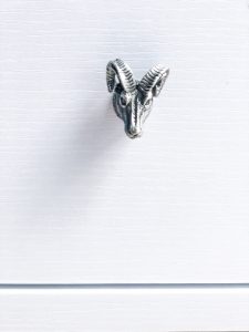
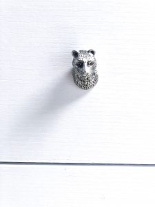
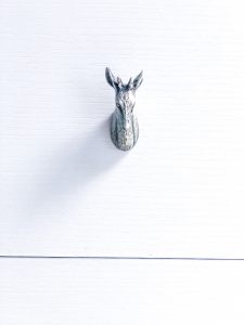
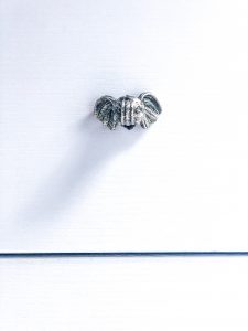
Closet and shelf space was an issue for this room. I had to be very creative. I had to put up shelves in the small corner of the room to hang some clothes and organizational boxes, as well as a drawer that I purchased online. Since there was a slight animal theme happening with the frames, I decided to carry that through with changing the original knobs on the drawers with small animal knobs that I found on, where else, Etsy! Changing something so simple as knobs can make such a big detailed difference. I recommend it for anyone who doesn’t want to spend a lot but wants a piece to look more expensive than it is. On one wall we have large windows that take up more than half of the wall. Underneath the windows is wall space, so I did custom shelving here with white and beige boxes that I placed to organize all their toys. I labeled them using my favorite label company, Pretty Little Designs, that custom made the labels and tags so that I can put them on the boxes. They have pretty labels for everything!
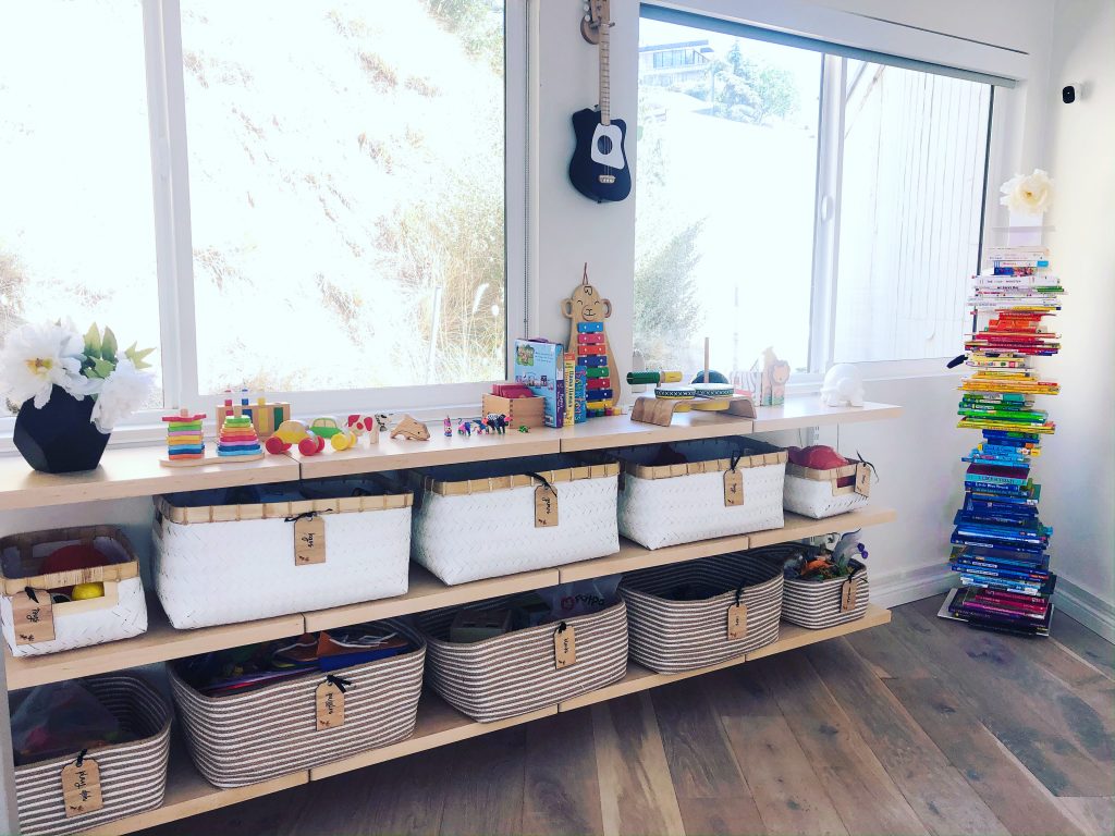
I also needed a place for all his books. We love books here at the Loong household, and since we don’t have space to put them, I decided on a vertical bookcase for small spaces and to save room!
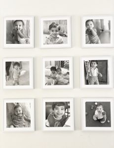
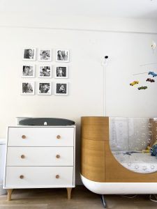
Since we were working with a small space, I made sure to buy a drawer that allowed me to place our existing Hatch changing table on top of it. There was empty wall space above that, and I couldn’t figure out what I wanted to put up there. Eventually I decided on easy to attached photos of the kids, printed in black and white, and with white frames.
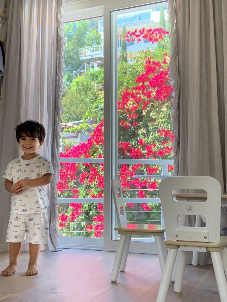
Lastly, I got this wonderfully special light fixture on Etsy that I am so in love with. I had a hard time decided what I wanted for the light fixture, but this one works so perfectly in the room. I also laid down a light grey textured rug, along with light grey curtains to finish up the look!
I hope you like the room as much as I enjoyed designing it!



 Hello, my name is Sepideh (my friends call me Sepi)! I am a blogger and world citizen. This is my blog, where I post all about my luxury travels, experiences and food establishments worth raving about. You’ll also find write-ups on products that I think are must-haves.




Leave a Comment